Your Floor Is the Most Dangerous Thing In Your House
By Julia Silge
February 17, 2016
I saw this analysis at Flowing Data about the most common consumer products involved in hospital ER visits and was delighted, interested, etc. Nathan’s next related post is, um, also super interesting, if entirely horrifying. Apparently, I am not the only one who thought this data set was compelling, because this week Hadley Wickham took the NEISS data set that these beautiful analyses are based on and made an R package for them.
RIGHT HAND PAIN AND SWELLING AFTER PUNCHING A WOODEN DOOR
Since the data set is wrapped up nicely in an R package, getting it is very easy. This is a pretty big data set, though; it includes the entire NEISS sample of injuries from 2009 to 2014. I did this blog post on an older laptop and it took my aging computer a bit to chug along and do some things. First, let’s download the data.
library(devtools)
install_github("hadley/neiss")
library(neiss)
Now, let’s open the main data set and look at the column names.
data(injuries)
names(injuries)
##  [1] "case_num"    "trmt_date"   "psu"         "weight"      "stratum"
##  [6] "age"         "sex"         "race"        "race_other"  "diag"
## [11] "diag_other"  "body_part"   "disposition" "location"    "fmv"
## [16] "prod1"       "prod2"       "narrative"
Each row is a case, i.e. injury. The consumer product(s) implicated in the injury are in prod1 and prod2 as numbers, which can be looked up in another data set, products.
data(products)
names(products)
## [1] "code" "title"
What, for example, is the product associated with code 235?
products[products$code == 235, 'title']
## Source: local data frame [1 x 1]
##
##                   title
##                   (chr)
## 1 electric waffle irons
Some of the other observations made for each injury include the age, sex, and race of the injured person, the diagnosis and body part injured, where the injury took place (at home, school, etc.), whether the fire department was involved, and a narrative describing what happened. The narratives are just, WOW.
Just For Starters
So just as a very first glimpse, what consumer products cause the most injuries in this data set?
library(dplyr)
injuries <- left_join(injuries, products, by = c("prod1" = "code")) %>%
        rename(product = title)
injuries$product <- as.factor(injuries$product)
injuries %>% group_by(product) %>% summarise(total = sum(weight)) %>%
        top_n(10, total) %>% arrange(desc(total))
## Source: local data frame [10 x 2]
##
##                                     product   total
##                                      (fctr)   (dbl)
## 1                           stairs or steps 7245304
## 2              floors or flooring materials 6177421
## 3      beds or bedframes, other or not spec 3551331
## 4  basketball (activity, apparel or equip.) 3150653
## 5   bicycles and accessories (excl mountain 3139063
## 6    football (activity, apparel or equip.) 2670743
## 7          knives, not elsewhere classified 2015212
## 8            chairs, other or not specified 1875416
## 9             doors, other or not specified 1781299
## 10 ceilings and walls (part of completed st 1777905
If you live in a house without stairs, it looks like your floor is the most dangerous thing in your house. (Is it weird that floors and stairs are “consumer products” in this data set?) These results, as we would expect, agree with the more detailed plots at Flowing Data.
Don’t Leave Your House! But Don’t Stay Home!
Let’s look at where these injuries occur, first for the dataset as a whole.
library(ggplot2)
injuries$location <- as.factor(injuries$location)
whereinjury <- injuries %>% group_by(location) %>% summarise(total = sum(weight))
ggplot(data = whereinjury,
       aes(x = location, y = total)) +
        geom_bar(stat = "identity", fill = "aquamarine4", alpha = 0.8) +
        theme(legend.position="none", axis.title.x = element_blank(),
              axis.text.x= element_text(angle=45, hjust = 1)) +
        ylab("Estimated number of injuries") +
        ggtitle("Location of Injuries")
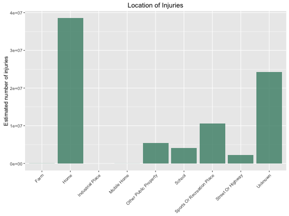
Is this different for males and females? (I have left out the injuries where no sex is listed.)
injuries$sex <- as.factor(injuries$sex)
whereinjury <- injuries %>% group_by(location, sex) %>% summarise(total = sum(weight)) %>%
        arrange(desc(total))
ggplot(data = whereinjury[whereinjury$sex != "None listed",],
       aes(x = location, y = total, fill = sex)) +
        geom_bar(alpha = 0.8, stat = "identity", position = "dodge") +
        scale_fill_manual(values = c("deeppink3", "deepskyblue4")) +
        theme(axis.title.x = element_blank(), legend.title=element_blank(),
              axis.text.x= element_text(angle=45, hjust = 1)) +
        ylab("Estimated number of injuries") +
        ggtitle("Location of Injuries")
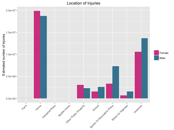
The numbers are so low that you can’t see them on the graph, but injuries at farms, industrial places, and mobile homes are all higher for males than females.
Does this change for people of different ages? This is going to get a little more complicated, because there are fewer 70-year-olds in America than 20-year-olds, but more women than men at those older ages. Who is more likely to be injured? And where?
Counting Injuries, Counting People
Let’s start by looking at the number of injuries by age and by sex.
sexageinjury <- injuries %>%
        group_by(sex, age = as.numeric(cut(age, breaks = (seq(0,100, by = 1))))-1) %>%
        summarise(total = sum(weight))
ggplot(data = sexageinjury[sexageinjury$sex != "None listed",],
       aes(x = age, y = total, color = sex)) +
        geom_line(size = 1.5, alpha = 0.9) +
        scale_color_manual(values = c("deeppink3", "deepskyblue4")) +
        theme(legend.title=element_blank(), legend.justification=c(1,1), legend.position=c(1,1)) +
        ylab("Estimated number of injuries") + xlab("Age") +
        ggtitle("Total Injuries by Age and Sex")
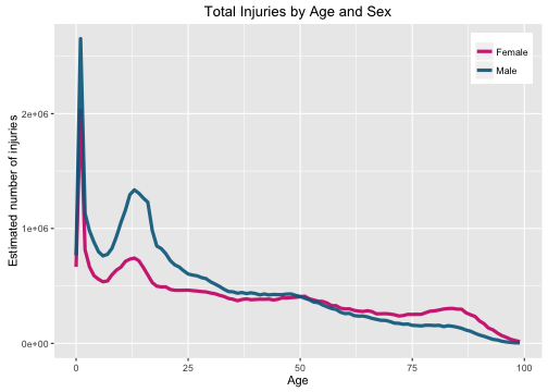
I have parented three children through their toddler years and oh, this graph makes me cringe. We only ended up at the ER once and that was an incident involving a collision with a child’s head and:
products[products$code == 1884,]
## Source: local data frame [1 x 2]
##
##    code                                    title
##   (int)                                    (chr)
## 1  1884 ceilings and walls (part of completed st
None of my kids have yet entered their teen years and now that second peak can cause me to be filled with DATA-DRIVEN DREAD. Anyway, you can see there are more males visiting the ER for an injury from a consumer product until about age 50, but women live longer than men, so there are more women alive at those wise, advanced years. What we want to do is divide by how many people there are at each age and sex to find the per capita rate. Hadley included a data set that contains just that information in the neiss package. Let’s load it.
data(population)
head(population)
## Source: local data frame [6 x 4]
##
##    year   age    sex       n
##   (int) (int)  (chr)   (int)
## 1  2000     0 female 1881822
## 2  2000     0   male 1974134
## 3  2000     1 female 1856084
## 4  2000     1   male 1942607
## 5  2000     2 female 1856028
## 6  2000     2   male 1944116
I am just looking at the whole NEISS dataset in aggregate, not dividing up by individual years, and this also could complicate matters. During the years 2009 to 2014, individuals obviously age, but does the age and sex distribution of the population of the United States change enough to make a big difference here?
population$sex <- as.factor(population$sex)
ggplot(data = population[population$year>=2009,],
       aes(x = age, y = n, color = sex)) +
        facet_wrap(~year) +
        geom_line(alpha = 0.9) +
        scale_color_manual(values = c("deeppink3", "deepskyblue4")) +
        theme(legend.title=element_blank(), legend.justification=c(0,0), legend.position=c(0,0)) +
        ylab("Number of people") + xlab("Age") +
        ggtitle("U.S. Population by Age and Sex")
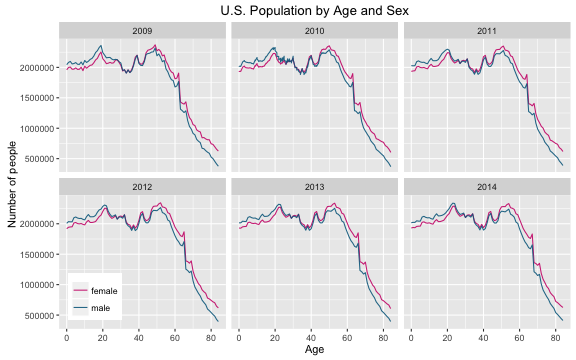
Those are close enough for my purposes that I am going to take a median and use that as the population distribution for the aggregated injury dataset.
medianpop <- population %>% filter(year >= 2009) %>% group_by(age, sex) %>%
        summarise(n = median(n))
Now let’s combine the population sex/age distribution with the total injuries by sex and age.
totalinjuries <- left_join(medianpop, sexageinjury, by = c("age" = "age"))
totalinjuries <- totalinjuries %>% filter(sex.x == tolower(sex.y)) %>%
        select(age, sex = sex.x, population = n, injuries = total)
What do we have at this point?
head(totalinjuries)
## Source: local data frame [6 x 4]
## Groups: age [3]
##
##     age    sex population injuries
##   (dbl) (fctr)      (int)    (int)
## 1     0 female    1932910    25647
## 2     0   male    2018420    30293
## 3     1 female    1938870    73325
## 4     1   male    2023253    96475
## 5     2 female    1950168    29266
## 6     2   male    2042522    40807
Now let’s divide the injuries by the population in each age/sex bin to get a rate. Let’s multiply by 100,000 to get a number that is per 100,000 population. Then let’s melt for some plotting.
library(reshape2)
totalinjuries <- totalinjuries %>% mutate(rate = injuries/population*1e5) %>%
        melt(id = c("age", "sex"))
levels(totalinjuries$variable) <- c("Population", "Estimated Injuries", "Injury Rate per 100,000 Population")
ggplot(data = totalinjuries,
       aes(x = age, y = value, color = sex)) +
        facet_wrap(~variable, ncol = 1, scales = "free_y") +
        geom_line(size = 1.2, alpha = 0.9) +
        scale_color_manual(values = c("deeppink3", "deepskyblue4")) +
        theme(legend.title=element_blank(), legend.justification=c(1,1), legend.position=c(1,1)) +
        ylab("Number") + xlab("Age") +
        ggtitle("Population and Injuries by Age and Sex")
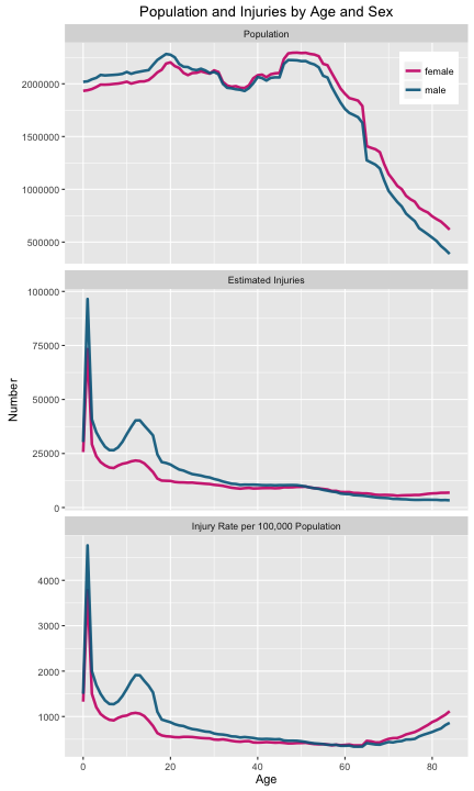
We can see the rate of injuries per capita increasing at the highest ages, but the injuries are still higher for women than men. I’ll be honest; this is not what I was expecting to see. Ahead of time, I thought that crossing point when injuries in women outnumber injuries in men was probably due to there being more older women than men. Let’s look in detail at injuries caused by a few types of consumer products.
TOILET COVER FELL ON TOE
Hadley shared some plots on Twitter while he was working on this package.
Toilet related injuries by age and sex pic.twitter.com/2HlXfFnZf3
— Hadley Wickham (@hadleywickham) February 15, 2016
This toilet-related one, naturally, caught everyone’s eye. Let’s reproduce that plot and then divide by the population at each age bin to see how the distribution changes.
toiletinjury <- injuries[injuries$prod1 == 649,] %>%
        group_by(sex, age = as.numeric(cut(age, breaks = (seq(0,100, by = 1))))-1) %>%
        summarise(total = sum(weight))
totalinjuries <- left_join(medianpop, toiletinjury, by = c("age" = "age"))
totalinjuries <- totalinjuries %>% filter(sex.x == tolower(sex.y)) %>%
        select(age, sex = sex.x, population = n, injuries = total) %>%
        mutate(rate = injuries/population*1e5) %>%
        melt(id = c("age", "sex"), measure = c("injuries", "rate"))
levels(totalinjuries$variable) <- c("Estimated Number of Injuries", "Injury Rate per 100,000 Population")
ggplot(data = totalinjuries,
       aes(x = age, y = value, color = sex)) +
        facet_wrap(~variable, ncol = 1, scales = "free_y") +
        geom_line(size = 1.2, alpha = 0.9) +
        scale_color_manual(values = c("deeppink3", "deepskyblue4")) +
        theme(legend.title=element_blank(), legend.justification=c(0,0.38),
              legend.position=c(0,0.38)) +
        ylab("Number") + xlab("Age") +
        ggtitle("Toilet-Related Injuries by Age and Sex")
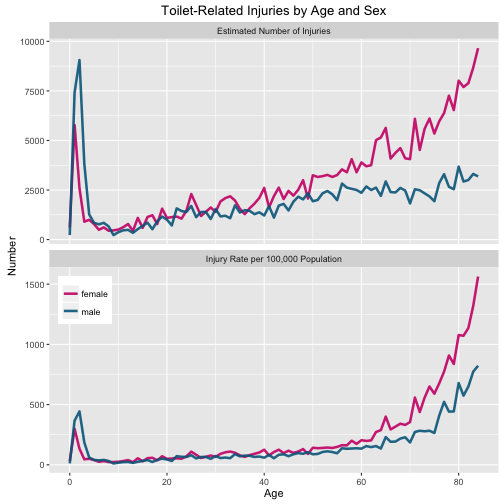
The reason my plot doesn’t extend to as high ages as Hadley’s is that the population data doesn’t extend to as high ages as the NEISS data. Also, the y-axes are different because Hadley must have been just using the number of cases (i.e. rows) in the data set at that point, but it actually contains a weight (weight) for each case that can be used to get a national estimate. (The NEISS is a sample of many hospitals, but not every single hospital in the United States; the weights are assigned so that we can use these data to get a national estimate.) More of substance, dividing by the population in each age/sex bin shows that the toilet-related injury rate increases significantly with age. The difference between older women and men is not due to there being more women in the older population; older women are more likely to suffer toilet-related injuries than older men. SAD. And also somewhat sensible, I suppose, if I stop to think about it. Everyone do some squats.
TRIED TO SKI JUMP, LEGS WENT APART IN AIR
Let’s do one more. I live in a ski-centric city, so let’s find all the skiing-related injuries.
skiinjury <- injuries[injuries$prod1 == 3283,] %>%
        group_by(sex, age = as.numeric(cut(age, breaks = (seq(0,100, by = 1))))-1) %>%
        summarise(total = sum(weight))
totalinjuries <- left_join(medianpop, skiinjury, by = c("age" = "age"))
totalinjuries <- totalinjuries %>% filter(sex.x == tolower(sex.y)) %>%
        select(age, sex = sex.x, population = n, injuries = total) %>%
        mutate(rate = injuries/population*1e5) %>%
        melt(id = c("age", "sex"), measure = c("injuries", "rate"))
levels(totalinjuries$variable) <- c("Estimated Number of Injuries", "Injury Rate per 100,000 Population")
ggplot(data = totalinjuries,
       aes(x = age, y = value, color = sex)) +
        facet_wrap(~variable, ncol = 1, scales = "free_y") +
        geom_line(size = 1.2, alpha = 0.9) +
        scale_color_manual(values = c("deeppink3", "deepskyblue4")) +
        theme(legend.title=element_blank(), legend.justification=c(1,1), legend.position=c(1,1)) +
        ylab("Number") + xlab("Age") +
        ggtitle("Skiing-Related Injuries by Age and Sex")
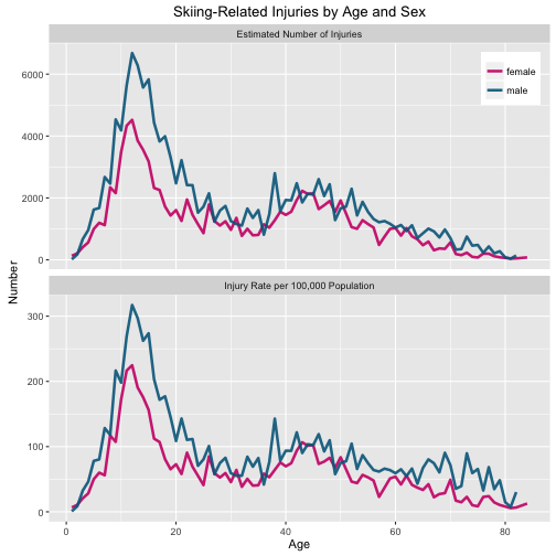
The distribution of these injuries is quite different from the total injuries or the toilet-related injuries. There is not much difference between the number of injuries and the per capita rate of injuries; the people getting injured skiing (probably, just the people skiing) have ages in the range where the distribution of ages is fairly flat so the two plots look mostly the same. There are not many babies and toddlers out there skiing and getting hurt, and the adults seem to be practicing safe skiing behavior. The big peak is just past age 10. That is… exactly the age of my oldest who now likes to ski black runs.
Back to Home and School and Public Property
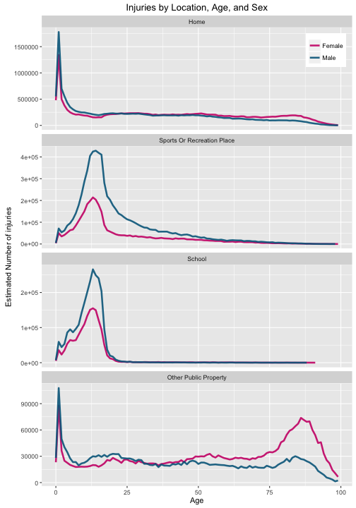
Now that we have a handle on this business with the population at different sex/age bins, let’s go back to the distribution of injury location. Let’s look at the top four locations that are not “unknown”.
whereinjury <- injuries %>% group_by(location, sex,
                                     age = as.numeric(cut(age,
                                                          breaks = (seq(0,100, by = 1))))-1) %>%
        summarise(total = sum(weight))
whereinjury$location = factor(whereinjury$location,levels(whereinjury$location)[c(2,7,6,5,1,3,4,8,9)])
plotlocation <- c("Home", "Other Public Property", "School",
                  "Sports Or Recreation Place")
ggplot(data = whereinjury[whereinjury$sex != "None listed" &
                                  whereinjury$location %in% plotlocation,],
       aes(x = age, y = total, color = sex)) +
        facet_wrap(~location, ncol = 1, scales = "free_y") +
        geom_line(size = 1.2, alpha = 0.9) +
        scale_color_manual(values = c("deeppink3", "deepskyblue4")) +
        theme(legend.title=element_blank(), legend.justification=c(1,1), legend.position=c(1,1)) +
        ylab("Estimated Number of injuries") + xlab("Age") +
        ggtitle("Injuries by Location, Age, and Sex")
And now let’s plot the rates per 100,000 population in each sex/age bin for these locations.
whereinjury <- left_join(medianpop, whereinjury, by = c("age" = "age"))
whereinjury <- whereinjury %>% filter(sex.x == tolower(sex.y)) %>%
        select(location, age, sex = sex.x, population = n, injuries = total) %>%
        mutate(rate = injuries/population*1e5)
ggplot(data = whereinjury[whereinjury$sex != "None listed" &
                                  whereinjury$location %in% plotlocation,],
       aes(x = age, y = rate, color = sex)) +
        facet_wrap(~location, ncol = 1, scales = "free_y") +
        geom_line(size = 1.2, alpha = 0.9) +
        scale_color_manual(values = c("deeppink3", "deepskyblue4")) +
        theme(legend.title=element_blank(), legend.justification=c(1,1), legend.position=c(1,1)) +
        ylab("Number of injuries per 100,000 population") + xlab("Age") +
        ggtitle("Injury Rate by Location, Age, and Sex")
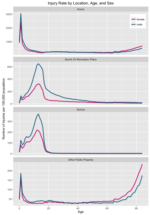
Teenagers are getting injured at school and at sports/recreation locations, while babies, toddlers, and the elderly are getting injured at home and in public. Here again we see that elderly women are injured at a higher rate than elderly men.
The End
I copy-and-pasted code a little bit in this post (FOR SHAME); I maybe should have defined some functions. There is SO MUCH MORE that can be explored with this data set. It is enormous. I didn’t touch most of the consumer products, or any of the date information, or any of the race information, or any of the information on type of injury or body part injured… You get the idea; go have a ball. Just be forewarned it might make you want to wrap everyone you love in bubblewrap. The R Markdown file used to make this blog post is available here. I am very happy to hear feedback or questions!