Opioid prescribing habits in Texas
By Julia Silge in rstats
October 12, 2019
A paper I worked on was just published in a medical journal. This is quite an odd thing for me to be able to say, given my academic background and the career path I have had, but there you go! The first author of this paper is a long-time friend of mine working in anesthesiology and pain management, and he obtained data from the Texas Prescription Drug Monitoring Program (PDMP) about controlled substance prescriptions from April 2015 to 2018. The DEA also provides data about controlled substances transactions between manufacturers and distributors (available in R) but PDMP data is somewhat different as it monitors prescriptions directly, down to the individual prescriber level. Each state maintains a separate PDMP, and access is often limited to licensed providers in that state. My coauthor/friend is, among other things, a licensed provider in Texas and was able to obtain this data for research purposes!
Clean and tidy the data
The first step in this analysis was to read in, clean, and tidy the PDMP data. This is a dataset of prescriptions for controlled substances, aggregated at the county and month level for us by the state agency; we requested data at two separate times and received data in two different formats. First, we have an Excel file.
library(tidyverse)
library(readxl)
library(lubridate)
library(googlesheets)

path <- "CountyDrugPillQty_2017_07.xlsx"

opioids_raw <- path %>%
    excel_sheets() %>%
    set_names() %>%
    map_df(~ read_excel(path = path, sheet = .x), .id = "sheet") %>%
    mutate(Date = dmy(str_c("01-", sheet))) %>%
    select(-sheet) %>%
    rename(Name = `Generic Name`)
Then we have a second batch of data in Google Sheets.
new_opioids_sheet <- gs_title("TX CS Qty By Drug Name-County")

new_opioids_raw <- new_opioids_sheet %>%
    gs_read("TX CS RX By Generic Name-County",
            col_types = "cnnnnnnnnnnnnnnnnnnnnnnnnnnnnnnnnnnnnnnnnnnnnnnnnnnnnnnnnnnnnnnnnnnnnnnnnnnnnnnnnnnnnnnnnnnnnnnnnnnnnnnnnnnnnnnnnnnnnnnnnnnnnnnnnnnnnnnnnnnnnnnnnnnnnnnnnnnnnnnnnnnnnnnnnnnnnnnnnnnnnnnnnnnnnnnnnnnnnnnnnnnnnnnnnnnnnnnnnnnnnnnnnnnn",
            skip = 4,
            verbose = FALSE) %>%
    rename(Name = `Date/Month Filter`)  %>%
    mutate(Date = case_when(str_detect(Name,
                                       "^[a-zA-Z]{3}-[0-9]{2}$") ~ Name,
                            TRUE ~ NA_character_)) %>%
    fill(Date, .direction = "down") %>%
    select(-`Grand Total`) %>%
    filter(Name != Date) %>%
    mutate(Date = dmy(str_c("01-", Date))) %>%
    select(Name, Date, everything())
We have overlapping measurements for the same drugs and counties from February to June of 2017. Most measurements were close, but the new data is modestly higher in prescription quantity, telling us something about data quality and how this data is collected. When we have it available, we use the newer values. My coauthor/friend placed the individual drugs into larger categories so that we can look at groupings between the individual drug level and the schedule level. Using all that, finally, we have a tidy dataset of prescriptions per county per month.
categories_sheet <- gs_title("Drug categories")

drug_categories <- categories_sheet %>%
    gs_read("Sheet1", verbose = FALSE) %>%
    rename(Name = `Generic Name`) %>%
    bind_rows(categories_sheet %>%
                  gs_read("Sheet2", verbose = FALSE) %>%
                  rename(Name = `Generic Name`)) %>%
    filter(Schedule %in% c("II", "III", "IV", "V"))

opioids_tidy <- opioids_raw %>%
    gather(County, PillsOld, ANDERSON:ZAVALA) %>%
    full_join(new_opioids_raw %>%
                  gather(County, PillsNew, ANDERSON:ZAVALA),
              by = c("Name", "Date", "County")) %>%
    mutate(Pills = coalesce(PillsNew, PillsOld),
           Pills = ifelse(Pills > 1e10, NA, Pills)) %>%
    replace_na(replace = list(Pills = 0)) %>%
    mutate(County = str_to_title(County)) %>%
    select(-PillsNew, -PillsOld) %>%
    left_join(drug_categories, by = "Name") %>%
    select(County, Date, Name, Category, Schedule, Pills) %>%
    filter(Name != "Unspecified",
           !is.na(Schedule)) %>%
    filter(Date < "2018-05-01")

opioids_tidy
## # A tibble: 1,234,622 x 6
## County Date Name Category Schedule Pills
## <chr> <date> <chr> <chr> <chr> <dbl>
## 1 Anders… 2015-04-01 ACETAMINOPHEN WITH CODEINE… Opioid III 37950
## 2 Anders… 2015-04-01 ACETAMINOPHEN/CAFFEINE/DIH… Opioid III 380
## 3 Anders… 2015-04-01 ALPRAZOLAM Benzodiaz… IV 52914
## 4 Anders… 2015-04-01 AMITRIPTYLINE HCL/CHLORDIA… Benzodiaz… IV 180
## 5 Anders… 2015-04-01 AMPHETAMINE SULFATE Amphetami… IV 60
## 6 Anders… 2015-04-01 ARMODAFINIL Stimulant IV 824
## 7 Anders… 2015-04-01 ASPIRIN/CAFFEINE/DIHYDROCO… Opioid III 0
## 8 Anders… 2015-04-01 BENZPHETAMINE HCL Amphetami… III 30
## 9 Anders… 2015-04-01 BROMPHENIRAMINE MALEATE/PH… Opioid V 0
## 10 Anders… 2015-04-01 BROMPHENIRAMINE MALEATE/PS… Opioid III 0
## # … with 1,234,612 more rowsIn this step, we removed the very small number of prescriptions that were missing drug and schedule information (“unspecified”). Now it’s ready to go!
Changing prescribing habits
The number of pills prescribed per month is changing at about -0.00751% each month, or about -0.0901% each year. This is lower (negative, even) than the rate of Texas’ population growth, estimated by the US Census Bureau at about 1.4% annually. Given what we find out further below about the racial/ethnic implications of population level opioid use in Texas and what groups are driving population growth in Texas, this likely makes sense.
opioids_tidy %>%
    count(Schedule, Date, wt = Pills) %>%
    mutate(Schedule = factor(Schedule, levels = c("II", "III", "IV", "V",
                                                  "Unspecified"))) %>%
    ggplot(aes(Date, n, color = Schedule)) +
    geom_line(alpha = 0.8, size = 1.5) +
    expand_limits(y = 0) +
    labs(x = NULL, y = "Pills prescribed per month",
         title = "Controlled substance prescriptions by schedule",
         subtitle = "Schedule IV drugs account for the most doses, with Schedule II close behind")
We can also fit models to find which individual drugs are increasing or decreasing. The most commonly prescribed drugs that exhibited significant change in prescribing volume are amphetamines (increasing) and barbiturates (decreasing).
Connecting to Census data
When I started to explore how this prescription data varied spatially, I knew I wanted to connect this PDMP dataset to Census data. My favorite way to use Census data from R is the tidycensus package. Texas is an interesting place. It’s not only where I grew up (and where my coauthor and friend lives), but the second largest state in the United States by both land area and population. It contains 3 of the top 10 largest cities in the United States, yet also 3 of the 4 least densely populated counties in the United States. It is also the seventh most ethnically diverse state with a substantially higher Hispanic population compared with the United States as a whole, but similar proportion of white and black residents. We can download Census data to explore these issues.
library(tidycensus)

population <- get_acs(geography = "county",
                      variables = "B01003_001",
                      state = "TX",
                      geometry = TRUE)
household_income <- get_acs(geography = "county",
variables = "B19013_001",
state = "TX",
geometry = TRUE)To look at geographical patterns, we will take the median number of pills prescribed per month for each county during the time we have data for.
opioids_joined <- opioids_tidy %>%
    group_by(County, Date) %>%
    summarise(Pills = sum(Pills)) %>%
    ungroup %>%
    mutate(Date = case_when(Date > "2017-01-01" ~ "2017 and later",
                            TRUE ~ "Before 2017")) %>%
    group_by(County, Date) %>%
    summarise(Pills = median(Pills)) %>%
    ungroup %>%
    mutate(County = str_to_lower(str_c(County, " County, Texas")),
           County = ifelse(County == "de witt county, texas",
                           "dewitt county, texas", County)) %>%
    inner_join(population %>% mutate(County = str_to_lower(NAME)), by = "County") %>%
    mutate(OpioidRate = Pills / estimate)
What are the controlled substance prescription rates in the top 10 most populous Texas counties?
opioids_joined %>%
  filter(Date == "2017 and later") %>%
  top_n(10, estimate) %>%
  arrange(desc(estimate)) %>%
  select(NAME, OpioidRate) %>%
kable(col.names = c("County", "Median monthly pills per capita"), digits = 2)| County | Median monthly pills per capita |
|---|---|
| Harris County, Texas | 5.68 |
| Dallas County, Texas | 6.20 |
| Tarrant County, Texas | 7.74 |
| Bexar County, Texas | 7.41 |
| Travis County, Texas | 6.40 |
| Collin County, Texas | 7.02 |
| Hidalgo County, Texas | 3.31 |
| El Paso County, Texas | 4.43 |
| Denton County, Texas | 7.58 |
| Fort Bend County, Texas | 5.17 |
These rates vary a lot; the controlled substance prescription rate in Tarrant County is almost 40% higher than the rate in Harris County.
library(sf)
library(viridis)

opioids_map <- opioids_joined %>%
  mutate(OpioidRate = ifelse(OpioidRate > 16, 16, OpioidRate))

opioids_map %>%
  mutate(Date = factor(Date, levels = c("Before 2017", "2017 and later"))) %>%
  st_as_sf() %>%
  ggplot(aes(fill = OpioidRate, color = OpioidRate)) +
  geom_sf() +
  coord_sf() +
  facet_wrap(~Date) +
  scale_fill_viridis(labels = scales::comma_format()) +
  scale_color_viridis(guide = FALSE) +
  labs(fill = "Monthly pills\nper capita",
       title = "Controlled substance prescriptions across Texas",
       subtitle = "The prescription rate was higher overall before 2017")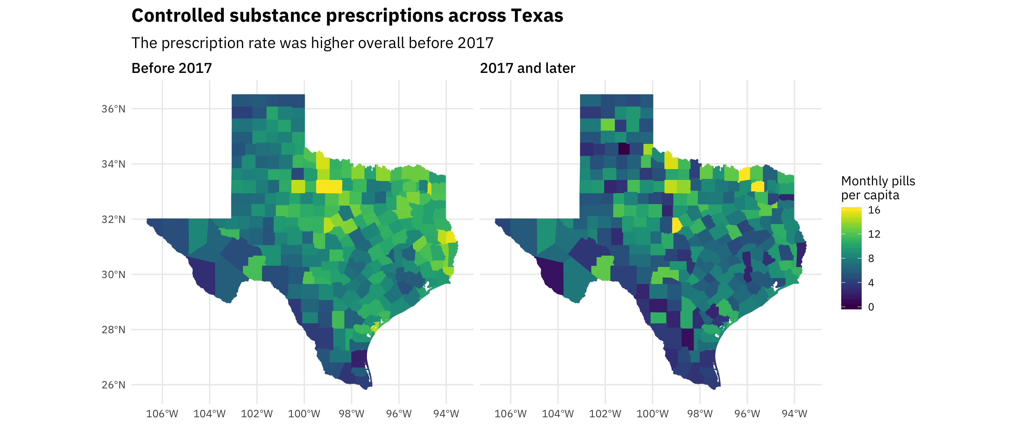
This strong geographic trend is one of the most interesting results from this analysis. There are low rates in the Rio Grande Valley and high rates in north and east Texas. When I saw that pattern, I knew we needed to look into how race/ethnicity was related to these controlled prescription rates. Also, notice the change over time as these rates have decreased.
We don’t see a direct or obvious relationship with household income, but, as the maps hint at, race is another matter.
race_vars <- c("P005003", "P005004", "P005006", "P004003")

texas_race <- get_decennial(geography = "county",
                            variables = race_vars,
                            year = 2010,
                            summary_var = "P001001",
                            state = "TX")

race_joined <- texas_race %>%
  mutate(PercentPopulation = value / summary_value,
         variable = fct_recode(variable,
                               White = "P005003",
                               Black = "P005004",
                               Asian = "P005006",
                               Hispanic = "P004003")) %>%
  inner_join(opioids_joined %>%
               filter(OpioidRate < 20) %>%
               group_by(GEOID, Date) %>%
               summarise(OpioidRate = median(OpioidRate)))

race_joined %>%
  group_by(NAME, variable, GEOID) %>%
  summarise(Population = median(summary_value),
            OpioidRate = median(OpioidRate),
            PercentPopulation = median(PercentPopulation)) %>%
  ggplot(aes(PercentPopulation, OpioidRate,
             size = Population, color = variable)) +
  geom_point(alpha = 0.4) +
  facet_wrap(~variable) +
  scale_x_continuous(labels = scales::percent_format()) +
  scale_y_continuous(labels = scales::comma_format()) +
  scale_color_discrete(guide = FALSE) +
  labs(x = "% of county population in that racial/ethnic group",
       y = "Median monthly pills prescribed per capita",
       title = "Race and controlled substance prescriptions",
       subtitle = "The more white a county is, the higher the median monthly pills prescribed there",
       size = "County\npopulation")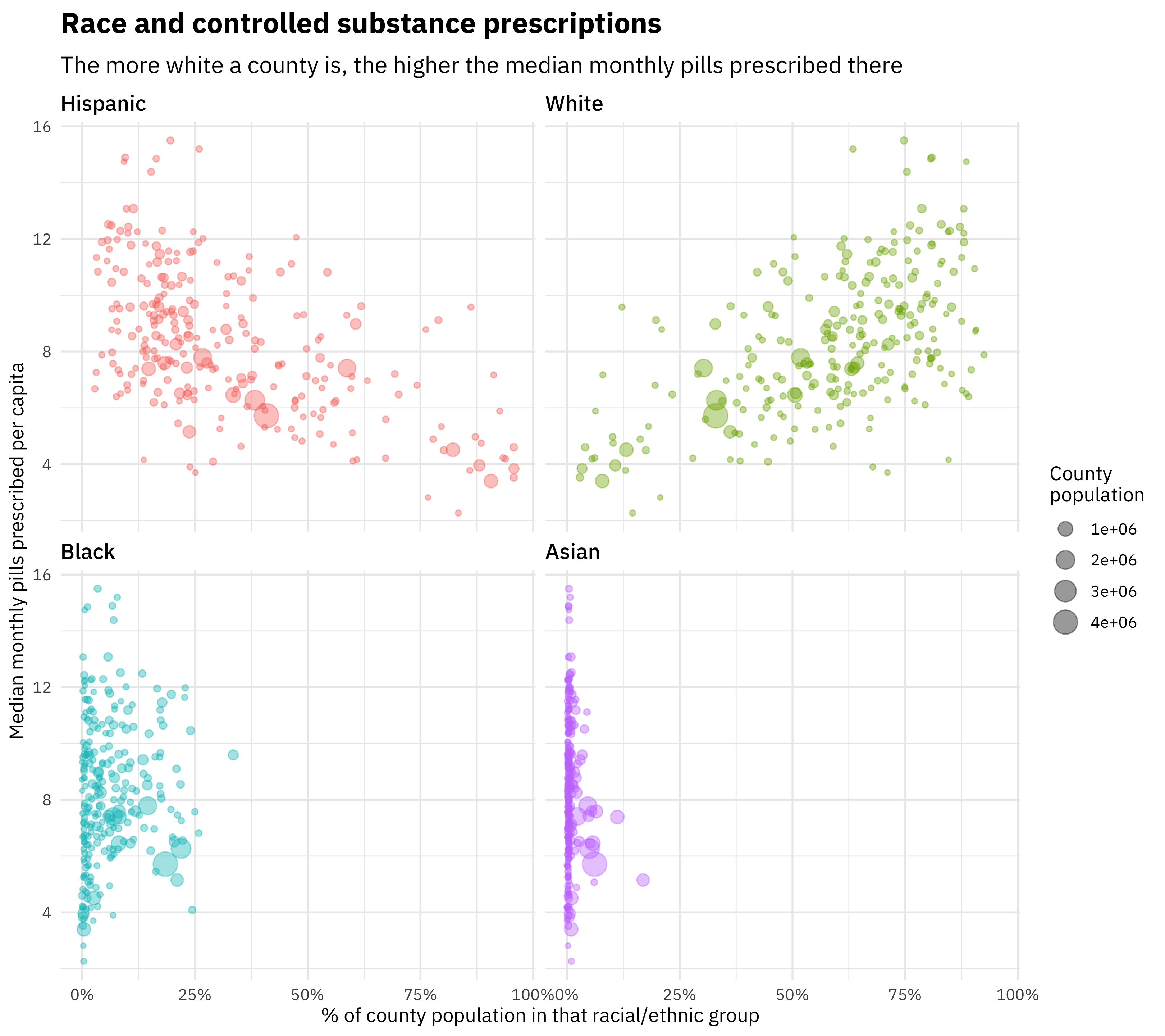
The more white a county is, the higher the rate of controlled substance prescription there. The more Hispanic a county is, the lower the rate of controlled substance prescription there. Effects with Black and Asian race are not clear in Texas.
Building a model
We used straightforward multiple linear regression to understand how prescription rates are associated with various factors. We fit a single model to all the counties to understand how their characteristics affect the opioid prescription rate. We explored including and excluding the various relevant predictors to build the best explanatory model that can account for the relationships that exist in this integrated PDMP and US Census Bureau dataset.
This was the first time I had used the huxtable package for a publication, and it was so convenient!
library(huxtable)

opioids <- race_joined %>%
  select(GEOID, OpioidRate, TotalPop = summary_value,
         variable, PercentPopulation, Date) %>%
  spread(variable, PercentPopulation) %>%
  left_join(household_income %>%
              select(GEOID, Income = estimate)) %>%
  select(-geometry, -GEOID) %>%
  mutate(Income = Income / 1e5,
         OpioidRate = OpioidRate,
         Date = factor(Date, levels = c("Before 2017", "2017 and later")),
         Date = fct_recode(Date, ` 2017 and later` = "2017 and later"))

lm1 <- lm(OpioidRate ~ Income + White, data = opioids)
lm2 <- lm(OpioidRate ~ Income + White + Date, data = opioids)
lm3 <- lm(OpioidRate ~ Income + Date + log(TotalPop), data = opioids)
lm4 <- lm(OpioidRate ~ Income + White + Date + log(TotalPop), data = opioids)

huxreg(lm1, lm2, lm3, lm4)| (1) | (2) | (3) | (4) | |
| (Intercept) | 5.640 *** | 6.468 *** | 8.394 *** | 3.668 *** |
| (0.524) | (0.508) | (0.847) | (0.785) | |
| Income | -3.209 ** | -3.229 *** | -0.239 | -4.432 *** |
| (0.973) | (0.922) | (1.063) | (0.941) | |
| White | 7.120 *** | 7.134 *** | 7.718 *** | |
| (0.560) | (0.531) | (0.536) | ||
| Date 2017 and later | -1.650 *** | -1.640 *** | -1.649 *** | |
| (0.216) | (0.251) | (0.211) | ||
| log(TotalPop) | 0.081 | 0.309 *** | ||
| (0.077) | (0.067) | |||
| N | 507 | 507 | 507 | 507 |
| R2 | 0.243 | 0.322 | 0.080 | 0.349 |
| logLik | -1194.782 | -1166.829 | -1244.045 | -1156.282 |
| AIC | 2397.563 | 2343.658 | 2498.091 | 2324.564 |
| *** p < 0.001; ** p < 0.01; * p < 0.05. | ||||
Model metrics such as AIC and log likelihood indicate that the model including income, percent white population, date, and total population on a log scale provides the most explanatory power for the opioid rate. Using the proportion of population that is Hispanic gives a model that is about as good; these are basically interchangeable but opposite in effect. Overall, the \(R^2\) of these models is not extremely high (the best model has an adjusted \(R^2\) of 0.359) because these models are estimating population level characteristics and there is significant county-to-county variation that is not explained by these four predictors alone. The population level trends are statistically significant and with the effect sizes at the levels shown here.
We can more directly explore the factors involved in this explanatory model (income, ethnicity, time) visually.
race_joined %>%
  filter(variable == "White") %>%
  left_join(household_income %>%
              as.data.frame() %>%
              select(GEOID, Income = estimate)) %>%
  filter(!is.na(Income)) %>%
  mutate(Income = ifelse(Income <= median(Income, na.rm = TRUE),
                         "Low income", "High income"),
         PercentPopulation = cut_width(PercentPopulation, 0.1)) %>%
  group_by(PercentPopulation, Income, Date) %>%
  summarise(OpioidRate = median(OpioidRate)) %>%
  mutate(Date = factor(Date, levels = c("Before 2017", "2017 and later"))) %>%
  ggplot(aes(PercentPopulation, OpioidRate, color = Income, group = Income)) +
  geom_line(size = 1.5, alpha = 0.8) +
  geom_smooth(method = "lm", lty = 2, se = FALSE) +
  scale_y_continuous(labels = scales::comma_format(),
                     limits = c(0, NA)) +
  scale_x_discrete(labels = paste0(seq(0, 0.9, by = 0.1) * 100, "%")) +
  theme(legend.position = "top") +
  facet_wrap(~Date) +
  labs(x = "% of county population that is white",
       y = "Median monthly pills prescribed per 1k population",
       color = NULL,
       title = "White population, income, and controlled substance usage",
       subtitle = "Before 2017, the more white a county was, the more low income was associated with more controlled substance usage")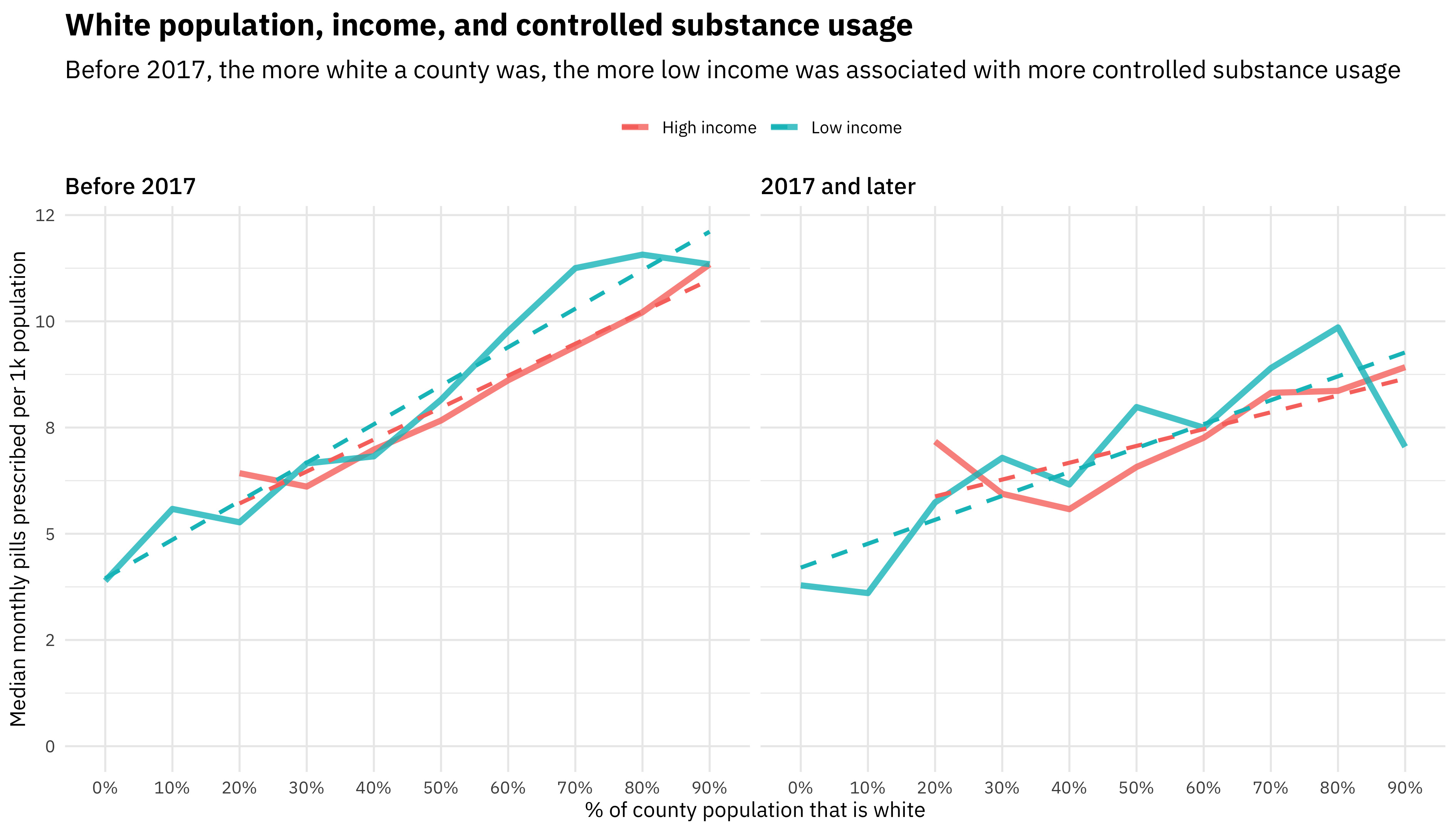
This plot illustrates the relationship between white population percentage and income, and how that has changed with time. The difference in controlled substance usage between lower and higher income counties (above and below the median in Texas) changes along the spectrum of counties’ population that is white.
The first effect to notice here is that the more white a county is, the higher the rate of controlled substance prescriptions. This was true both before 2017 and for 2017 and later, and for both low-income and high-income groups of counties. The second effect, though, is to compare the slopes of the two lines. Before 2017, the slope was shallower for higher income counties (above the median in Texas), but in lower income counties (below the median in Texas), the slope was steeper, i.e., the increase in prescription rate with white percentage was more dramatic. For 2017 and later, there is no longer a difference between low-income and high-income counties, although the trend with white population percentage remains.
What have we learned here? In the discussion of our paper, we focus on the difference or disparity in opioid prescription rates with race/ethnicity, and how that may be related to the subjective nature of the evaluation of pain by medical practitioners. A racial/ethnic difference in opioid prescribing rate has been found in other studies using alternative data sources. We can understand the differences in how media, the healthcare system, and the culture at large have portrayed the opioid epidemic compared to previous drug epidemics (such as those of the 1980s) due to what populations are impacted.
Learn more
If you want to read more about this new analysis and related work, check out the paper. You can also look at the GitHub repo where I have various bits of code for this analysis, which is now public.