Reordering and facetting for ggplot2
By Julia Silge
July 1, 2019

I recently wrote about the release of tidytext 0.2.1, and one of the most useful new features in this release is a couple of helper functions for making plots with ggplot2. These helper functions address a class of challenges that often arises when dealing with text data, so we’ve included them in the tidytext package.
Let’s work through an example
To show how to use these new functions, let’s walk through a more general example that does not deal with results that come from unstructured, free text. These helper functions are very often helpful in text analysis, but that’s not the only time I find myself reaching for them.
For this example, let’s use the babynames dataset of names given to children in the US, and find which names were most common in the 1950s, 1960s, 1970s, and 1980s.
library(tidyverse)
library(babynames)

top_names <- babynames %>%
    filter(year >= 1950,
           year < 1990) %>%
    mutate(decade = (year %/% 10) * 10) %>%
    group_by(decade) %>%
    count(name, wt = n, sort = TRUE) %>%
    ungroup

top_names
## # A tibble: 100,527 x 3
## decade name n
## <dbl> <chr> <int>
## 1 1950 James 846042
## 2 1950 Michael 839459
## 3 1960 Michael 836934
## 4 1950 Robert 832336
## 5 1950 John 799658
## 6 1950 David 771242
## 7 1960 David 736583
## 8 1960 John 716284
## 9 1970 Michael 712722
## 10 1960 James 687905
## # … with 100,517 more rowsNotice that we can already tell that some of the top names in these adjacent decades are the same (Michael, John, David) but are in different orders. Let’s try to make a plot looking at these top names. What does the plot look like if we don’t try to order the names at all?
top_names %>%
    group_by(decade) %>%
    top_n(15) %>%
    ungroup %>%
    mutate(decade = as.factor(decade)) %>%
    ggplot(aes(name, n, fill = decade)) +
    geom_col(show.legend = FALSE) +
    facet_wrap(~decade, scales = "free_y") +
    coord_flip() +
    scale_y_continuous(expand = c(0,0)) +
    labs(y = "Number of babies per decade",
         x = NULL,
         title = "What were the most common baby names in each decade?",
         subtitle = "Via US Social Security Administration")
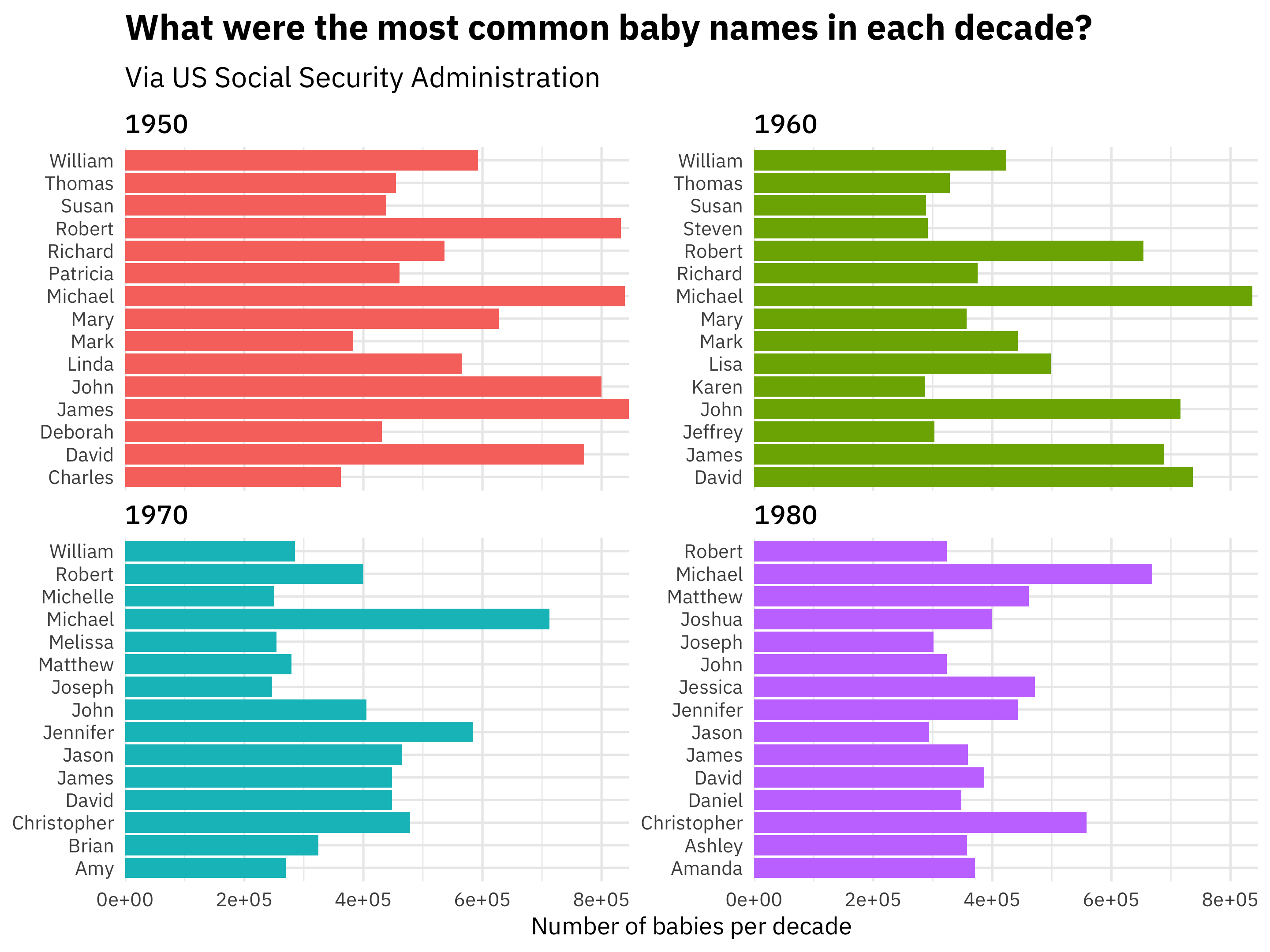
Here, ggplot2 puts the names in alphabetical order, because they are of type character. This is… not so useful or pleasing, I think most people would agree. 😩 What if instead we order the names by n, the number of babies per decade?
top_names %>%
    group_by(decade) %>%
    top_n(15) %>%
    ungroup %>%
    mutate(decade = as.factor(decade),
           name = fct_reorder(name, n)) %>%
    ggplot(aes(name, n, fill = decade)) +
    geom_col(show.legend = FALSE) +
    facet_wrap(~decade, scales = "free_y") +
    coord_flip() +
    scale_y_continuous(expand = c(0,0)) +
    labs(y = "Number of babies per decade",
         x = NULL,
         title = "What were the most common baby names in each decade?",
         subtitle = "Via US Social Security Administration")
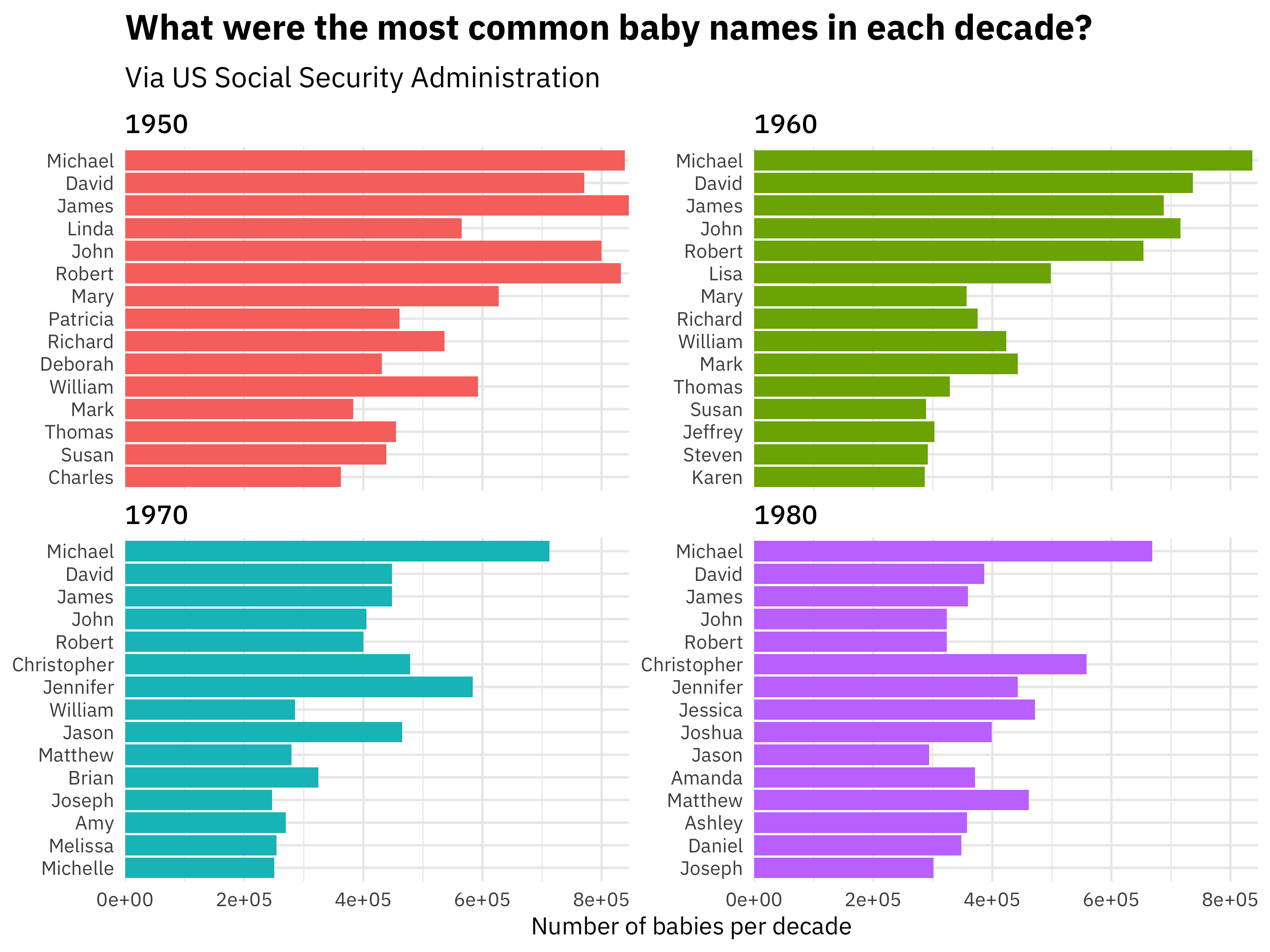
Well, this sort of worked. 😐 Mostly worked, one might say. What fct_reorder() and the similar reorder() function from base R do is to reorder all of these together, not reorder these names individually within some category and keep track of that.
Enter reorder_within()
Back in 2016, Tyler Rinker put together a solution for this problem, and David Robinson has had this wrapped up in some functions in his personal R package for a while now. Thanks to a PR from Tim Mastny, this functionality is now available in tidytext, as of version 0.2.1.
How does it work? We need to add two new functions.
library(tidytext)

top_names %>%
    group_by(decade) %>%
    top_n(15) %>%
    ungroup %>%
    mutate(decade = as.factor(decade),
           name = reorder_within(name, n, decade)) %>%
    ggplot(aes(name, n, fill = decade)) +
    geom_col(show.legend = FALSE) +
    facet_wrap(~decade, scales = "free_y") +
    coord_flip() +
    scale_x_reordered() +
    scale_y_continuous(expand = c(0,0)) +
    labs(y = "Number of babies per decade",
         x = NULL,
         title = "What were the most common baby names in each decade?",
         subtitle = "Via US Social Security Administration")
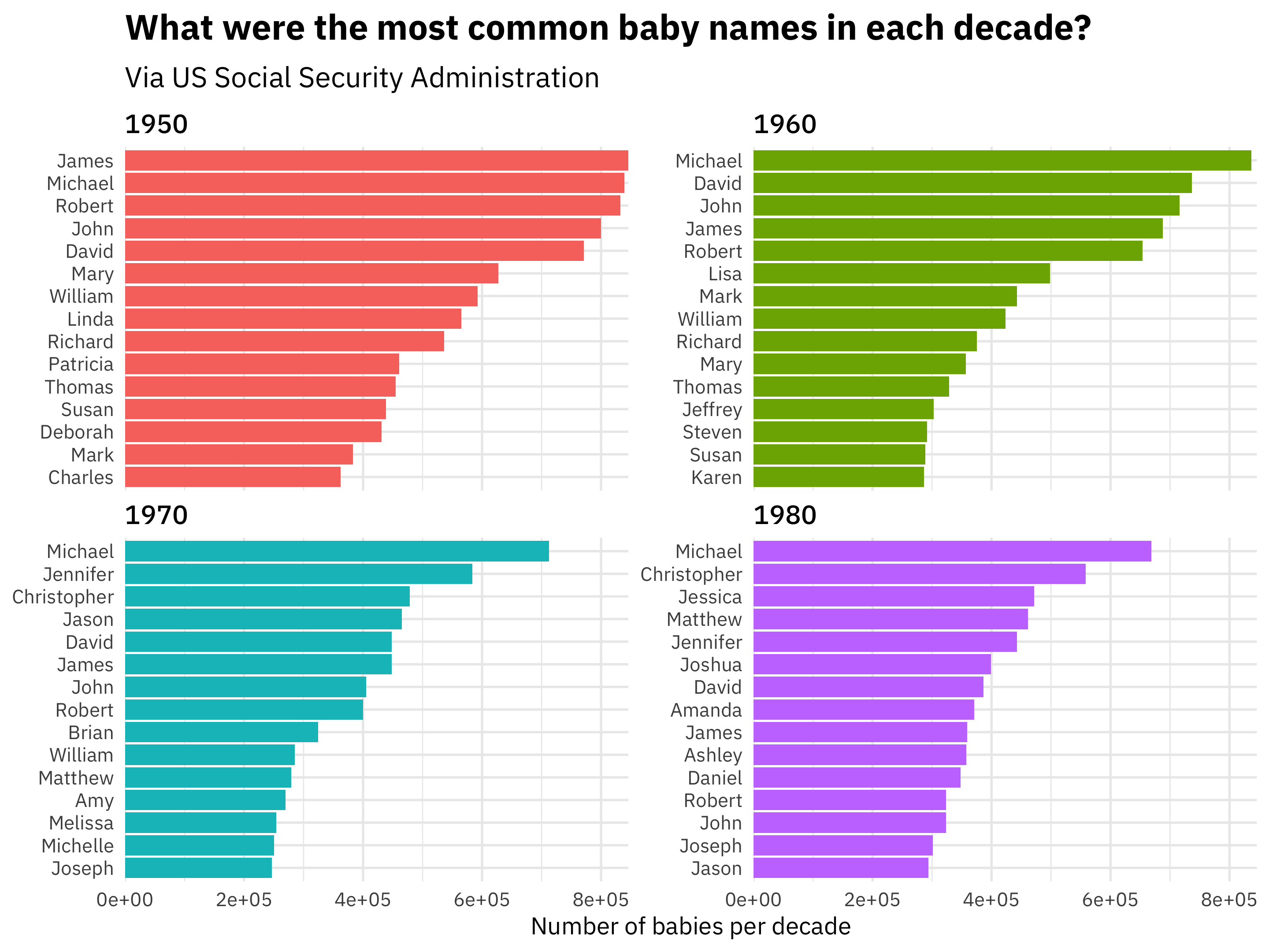
Aaaaaaah, much better! 😎 Notice that first, we used reorder_within() with three arguments:
- the item we want to reorder
- what we want to reorder by
- the groups or categories we want to reorder within
Then we used scale_x_reordered() to finish up making this plot. This scale() function can take all the usual arguments you might want to pass along to such a thing in ggplot2, like expand or anything like that.
I use this approach whenever I have counts, tf-idf, or another quantity I want to plot across facets when there are overlapping values but I want each facet to display in rank order. I’m glad that these helper functions are now easily available in a package on CRAN, because I have found them quite helpful in my own day-to-day work.
It was interesting work to get this into tidytext and supported there, as it is the first function for plotting we have included. I got to learn about building some tests for ggplot2 objects, including how to test actual plots using vdiffr. I hope the results of that work are useful to lots of folks!